Category

Tips

Abandon All Tips

By Tips No Comments

So, how many blogs about graphic design have you read? Did you find any particularly useful? We figured a better way to learn, is to abandon those complex design tips and focus on the simple things. You may be a hot mess when it comes to DIY graphic design, so just we wanna save your soul.

But if this is your first time here, check out our last post Nacho Average Tips. If you’re able to implement any of our advice and elevate your design, then just know my Team loves Krispy Kreme. Original glazed if you please.

So, shall we jump right in?

Go Big or Go Gnome.

Graphic designers often write about type hierarchy like you already know what the hell it is. Simply put, it means the message that’s the most important, should be set in the biggest font size. Prob your headline. And then using various-sized type, you can direct their eyeballs to where you want them to go next.

You can use color, spacing, weight, and other factors to create this hierarchy, but working with type size is better. The goal is to guide your reader through the entire piece of content and hopefully (if not insurance-webinar-dull), tap on the call-to-action. The ultimate goal of graphic design.

Oh, and check out this hierarchy magic right here…

White of the Living Dead.

Your audience can easily spot amateur graphic design vs professional design – and a dead giveaway of an amateur post is a logo in a white box. Honestly, it’s gawd awful and likely caused by the .jpg file you imported into the layout.

A .jpg logo comes with a white background, but a .png is transparent and can be placed on virtually any coloured background. Cool, huh?

When possible though, it’s better to use a vector file (.svg .eps .ai) but ask your graphic designer or marketer for the right file type. Any self-respecting designer will provide all of the necessary logo files to your company, arranged neatly by what each is used for.

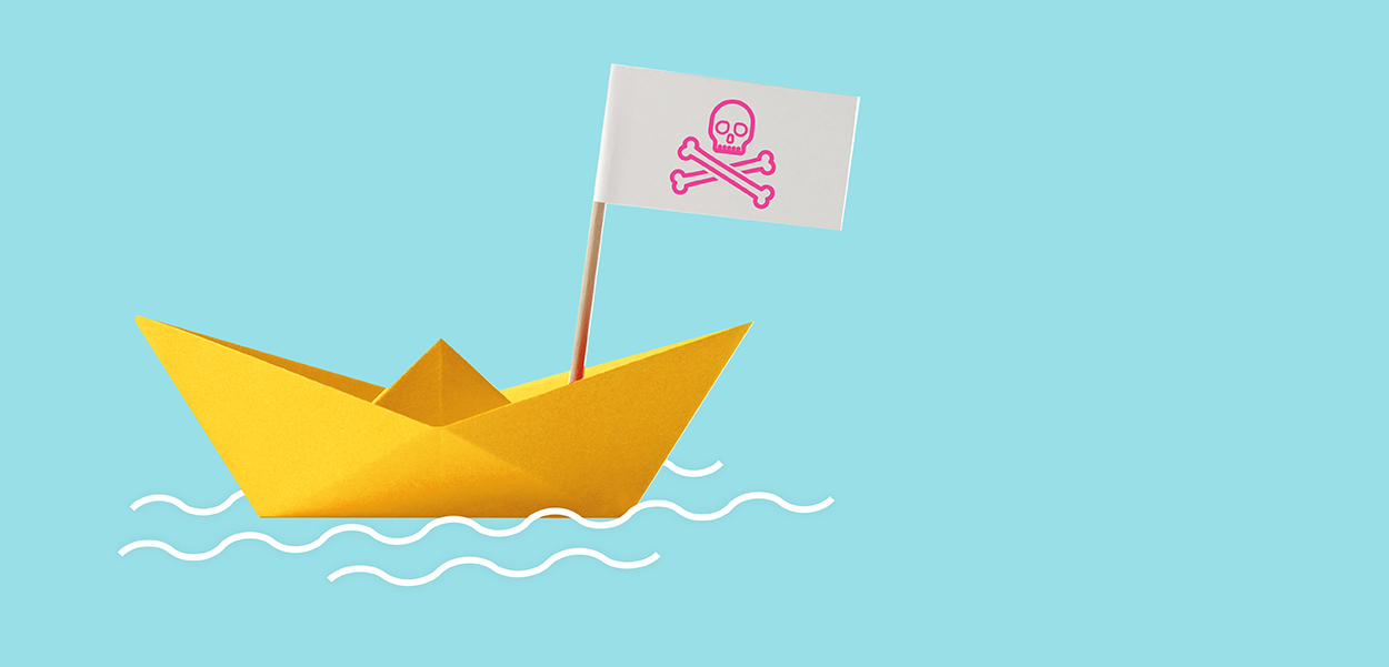
Don’t be Flank Sinatra.

You know when people place emojis, flags or icons on both sides of a headline? We call that “book-ends” or “flank the headline.” Your headline doesn’t need decoration, so this is a bit on the amateurish side too.

Taking that further, your reader needs to find the starting point to engage with your post, but if you place a cute emoji to the left of that, it makes it difficult to read. Trivial maybe, but we’re talking about simple fixes to your design, and this is just one of those things that makes content harder to read.

So, knot bad, eh?

Well, nautical puns aside, this post was easy – and the tips are simple enough to implement right now. And while they seem awfully simple, mastering graphic design is often about getting the small things right. Come back again. I’ll post more tips if I’m not distrac ­– hey, who brought donuts?

Nacho Average Tips

By Tips No Comments

So, you’ve come here looking for graphic design tips, huh?

Well, we aint gonna be talking about colour theory, white space or the anatomy of typography. How about some actual, usable design tips that you can implement right now?

And let’s start with the stuff DIY-designers and design newbies get wrong (but are easily fixable). It’s ok, we’re not judging, we just wanna help YOU make better content.

Margins (or lack thereof).

For the love of margins, back off from the edge, will ya? When you place text and images too close to the page edge, ­it’s claustrophobic. Like when you’re jammed in a tiny elevator facing your work-crush and you had garlic pesto for lunch. It’s embarrassing. But in reality, it makes the reader work too hard to know where to begin.

Make your margins at least 50 pixels. Hmm, make that 60.

Gotta make this stand out. And this. And that too.

Noooooo! You do not. Listen, your readers are scrolling so fast, that it’s better to keep your layout simple. Focus on ONE message and make THAT stand out to catch their eye. Hook ‘em and if it’s important enough, they’ll stop ­– wait a minute, fill my cup…

– damn, sorry for the Uptown Funk distraction.

But yeah, avoid underlining, highlighting and go easy on the bolding too. K?

Superfluous is an excessively long word.

When people create ads and posts on social, they often add words that are unnecessary. Superfluous words. Like when I’m explaining to my wife that I’m golfing again on Sunday, I tend over communicate and use more words hoping it will justify my request. But we know less is more and it gets to the point faster… Golf Sunday? No? Ok, sure then, I’d love to watch the Hallmark Channel with you.

By removing extra words, your reader will absorb your message faster and will retain it longer.

So, are those enough tips for now? Check back often as I’ll try to add more. I probably won’t though as I’m often distrac ­

– hey, who brought donuts?

But I will def post more useful content for you. Design content. Cause I’m a (we’re) designers.

Squeeze your design budget

By Tips No Comments

1. Stop paying a premium for rush!

In the 21 years I’ve managed Synergy Design, we’ve never once charged a client a rush fee, I just don’t believe in it. A solid agency should have the bandwidth to handle urgent projects and have some buffer built into their studio.

On the other hand, if you tell your designer it’s urgent every time, they’ll quickly learn that it’s not. If you want to be a great client, be honest about your deadlines. Build trust with your agency by giving them time when you have it and you’ll be in great shape to call in a favour when you’re in deep sh@*# because the content was due last week.

2. Multiple layouts = Mucho dinero

Designers generally pour their heart and soul into the first layout, so requesting additional designs (of diminishing quality) may not get you far.

And since you’re likely paying for each one, maybe you should ask to see the first layout first – you may not need a second or even a third. However, if you work with an agency with several designers, then requesting multiple layouts typically means you’ll get multiple designers. Well worth the investment.

3. Whoa, hang on, you’re not ready for design

A huge part of the design process is managing incoming assets. If you drip feed your agency with copy today, logos tomorrow, and the photos next week, it can add significant project management time.

Oh, and try to provide copy that’s been edited. Why? Well, designers are happy to make minor edits on the fly, but often they’re making major edits typically because they’re working with draft copy. So, save your dinero by editing and proof-reading the copy before sending it for design.

4. Uh oh, did you go past 3 revisions?

The industry standard of capping edits to just 3 rounds is older than my grandpa’s Cadillac. I can’t recall when a project was wrapped up in 5 rounds, let alone 3. Designers know this and will often use “extra revisions” as a chance to pad the bill.

However, a good agency will have plenty of work on hand and won’t be desperate to squeeze every dollar out of you. They recognize that every client is different, so handcuffing them to a pre-determined amount of changes impedes the relationship. Try negotiating at least 5 rounds of revisions with your designer, you’re going to need them. Uh, better make it 6, and read more about edits and changes here.

5. Scope creep

On the other hand, unforeseen major changes in a project or scope beyond what was quoted, will happen.

This often occurs gradually, and most designers will let it go, but when it gets out of hand both parties should be honest and work out a compromise on additional fees. There’s that trust thing again. I’m starting to see a pattern here.

6. Flat fee

And finally, ask your designer or creative agency about flat fee, per project pricing instead of hourly or retainer. It can often be difficult for inexperienced designers to know how long a project will take, and their invoice could be a big surprise. Like the state of Texas big. Of course, a seasoned agency will have designed a project like yours before, so they’ll have the confidence to quote you a flat fee, no surprises, and no hidden fees. Read more about that here because hey, I could use the backlink.

Ok, is that enough to get you started?

I have other thoughts on how to squeeze more from that creative budget of yours. Something about using templates, repurposing content, and even becoming exclusive with a creative partner you can trust. Honestly, that last part is the best way to squeeze your budget. But we’ll address that another time, I’ve got to go and squeeze my wife now… Her budget I mean, her budget.

Close Menu