So, how many blogs about graphic design have you read? Did you find any particularly useful? We figured a better way to learn, is to abandon those complex design tips and focus on the simple things. You may be a hot mess when it comes to DIY graphic design, so just we wanna save your soul.
But if this is your first time here, check out our last post Nacho Average Tips. If you’re able to implement any of our advice and elevate your design, then just know my Team loves Krispy Kreme. Original glazed if you please.
So, shall we jump right in?
Go Big or Go Gnome.
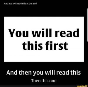
Graphic designers often write about type hierarchy like you already know what the hell it is. Simply put, it means the message that’s the most important, should be set in the biggest font size. Prob your headline. And then using various-sized type, you can direct their eyeballs to where you want them to go next.
You can use color, spacing, weight, and other factors to create this hierarchy, but working with type size is better. The goal is to guide your reader through the entire piece of content and hopefully (if not insurance-webinar-dull), tap on the call-to-action. The ultimate goal of graphic design.
Oh, and check out this hierarchy magic right here…

White of the Living Dead.
Your audience can easily spot amateur graphic design vs professional design – and a dead giveaway of an amateur post is a logo in a white box. Honestly, it’s gawd awful and likely caused by the .jpg file you imported into the layout.
A .jpg logo comes with a white background, but a .png is transparent and can be placed on virtually any coloured background. Cool, huh?
When possible though, it’s better to use a vector file (.svg .eps .ai) but ask your graphic designer or marketer for the right file type. Any self-respecting designer will provide all of the necessary logo files to your company, arranged neatly by what each is used for.
Don’t be Flank Sinatra.
You know when people place emojis, flags or icons on both sides of a headline? We call that “book-ends” or “flank the headline.” Your headline doesn’t need decoration, so this is a bit on the amateurish side too.
Taking that further, your reader needs to find the starting point to engage with your post, but if you place a cute emoji to the left of that, it makes it difficult to read. Trivial maybe, but we’re talking about simple fixes to your design, and this is just one of those things that makes content harder to read.
So, knot bad, eh?
Well, nautical puns aside, this post was easy – and the tips are simple enough to implement right now. And while they seem awfully simple, mastering graphic design is often about getting the small things right. Come back again. I’ll post more tips if I’m not distrac – hey, who brought donuts?
- So, “what’s it cost?” - December 14, 2022
- Small of Duty - December 15, 2020
- Abandon All Tips - November 5, 2020


