CASE Study
TalentNet
Branding
Marketing Collateral
TalentNet empowers the world’s leading brands to engage directly with talent through a seamless hiring experience while simplifying supply chain complexity and reducing talent acquisition costs.
Industry
SaaS/Talent Acquisition Technology
Company Size
50+ Employees
Project Deliverables
Discovery & Research + Strategy + Brand Guide
Development + Marketing Collateral
Discovery & Research + Strategy + Brand Guide Development + Marketing Collateral



strategy
+ branding
The Challenge
TalentNet approached us midway through their website overhaul. With their site already underway, they were looking to organize and expand their brand from that foundation. We refined the existing brand elements and introduced new ideas for their marketing collateral, creating a cohesive system and clear brand guidelines that defined the rationale and application of the refreshed brand.
Goals and Objectives
- Streamlined brand elements
- Develop a clear and cohesive brand identity
- Provide consistent collateral that could be used immediately

The Process
We began with a disocvery call with TalentNet’s Head of Marketing, where we discussed what they liked about the new brand and explored their key pain points. Together, we established a clear list of deliverables and a project schedule that prioritized their most urgent needs.
We then conducted an assessment of TalentNet’s new site and against existing collateral. While the brand had many strong elements, we noticed the use of varied imagery was diluting its impact, creating an inconsistent look. This revealed a clear opportunity to streamline visuals and strengthen the overall brand presence.
Solutions
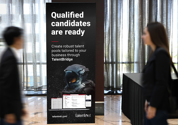
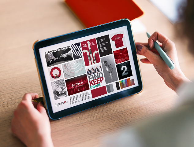
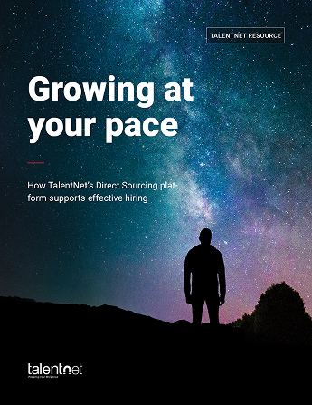
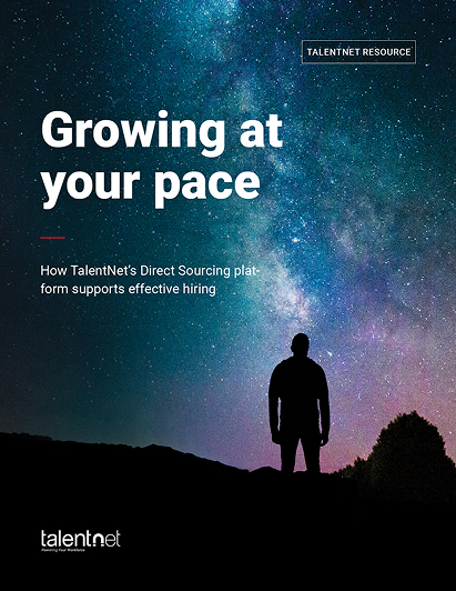
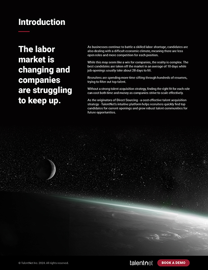
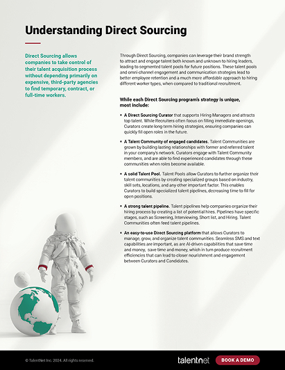
After presenting our findings to TalentNet, we worked closely with their team to refine a photo identity that reflected their motto, Big & Bold. Imagery conveying a grand sense of scale, such as aerial photography and outer space visuals, helped create the strong impact they were aiming to achieve.
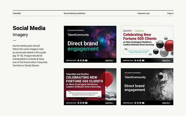
With these principles established, we also shaped a brand system the team could confidently rely on. We delivered comprehensive brand guidelines outlining messaging, logo usage, typography, colour application, and imagery direction.
We included examples of incorrect brand application to help highlight common pitfalls and make them easier to recognize and avoid in the future. At the same time, we curated an approved image library to ensure consistency across all marketing materials.
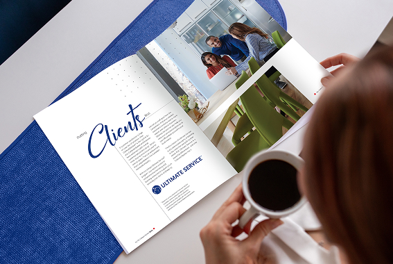
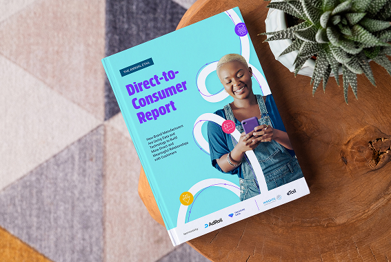
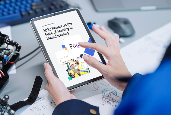
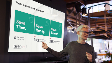
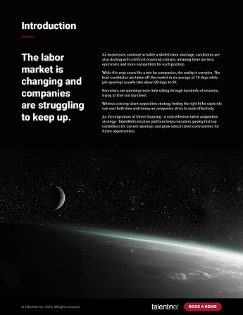
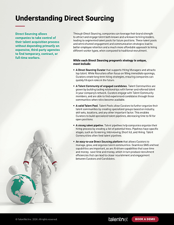
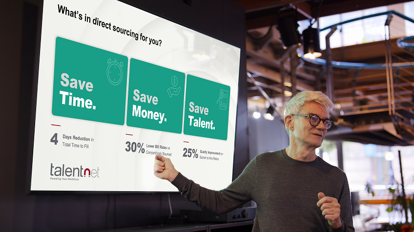
With the visual brand firmly established, the Synergy team rolled it out across multiple assets, including a sales presentation, white paper, social media posts, case study, and trade show booth.


Results
- Strong and consistent brand
- Ready-to-use marketing collateral for their entire team
- Clear brand guidelines
- Rebrand successfully presented at industry tradeshow booth